Load Testing APDEX Report
Overview
APDEX (Application Performance Index) is a widely used metric to measure and report on the satisfaction of application users based on response times. JMeter, a popular load testing tool, can be configured to calculate and report APDEX scores during performance testing. Here’s a breakdown of what APDEX is and how it can be implemented in JMeter.
A request summary graph showing the Success and failed requests (Transaction Controller Sample Results are not taken into account) percentage.

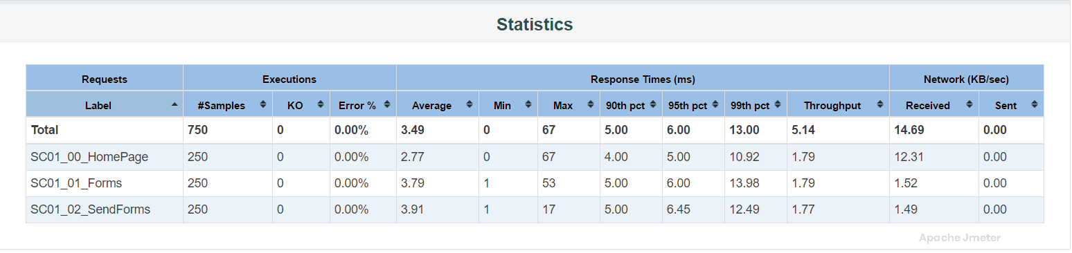
Statistics Table
the “Statistics Table” provides a comprehensive summary of performance metrics collected during a load test. This table includes essential statistics related to response times, throughput, error rates, and other key indicators. Understanding the Statistics Table is crucial for analyzing test results and making informed decisions about application performance.
Components of the Statistics Table:
The Statistics Table usually includes the following metrics and columns:
Label (Sampler Name):
This column lists the names of samplers or HTTP requests included in your JMeter test plan.
Each row corresponds to a specific sampler or request, representing different parts of your application.
Samples:
The Samples column displays the total number of samples (requests) executed for each sampler during the test.
This metric indicates the workload applied to different parts of the application.
Average:
The Average column shows the average (mean) response time for each sampler.
It provides a central measure of response time performance, representing the typical or expected response time.
Median:
The Median column displays the median response time for each sampler.
The median is the middle value in a sorted list of response times and offers insight into response time distribution.
90% Line (90th Percentile):
This column represents the response time at the 90th percentile for each sampler.
The 90th percentile indicates the response time threshold that 90% of requests fall below.
Min (Minimum):
The Min column shows the minimum response time observed for each sampler during the test.
It highlights the fastest response time recorded.
Max (Maximum):
The Max column displays the maximum response time observed for each sampler.
It identifies the slowest response time recorded.
Error% (Error Percentage):
The Error% column shows the percentage of failed or erroneous requests for each sampler.
A higher error percentage indicates a higher rate of request failures.
Relationship with APDEX:
Influencing APDEX Score:
The metrics in the Statistics Table directly contribute to the APDEX score calculation.
Low average response times, minimal errors, and consistent performance lead to higher APDEX scores, reflecting better user satisfaction.
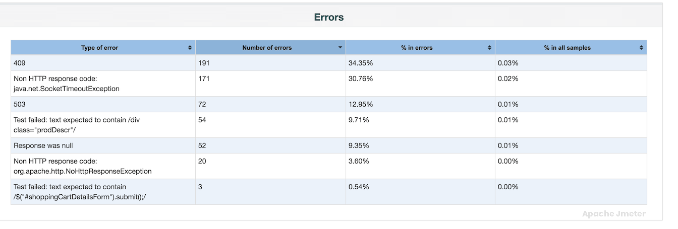
Error Table
The “Error Table” provides a detailed summary of the errors encountered during a performance test, including information about the type of error, frequency, and other relevant details. This table is essential for identifying and diagnosing issues that affect application performance and user experience.
Components of the Error Table:
The Error Table typically includes the following columns:
Error Type:
This column identifies the type or category of error encountered during the test execution.
Examples of error types include HTTP errors (e.g., 404 Not Found, 500 Internal Server Error), socket/connection timeouts, assertion failures, etc.
Error Count:
The Error Count column indicates how many times each specific error type occurred during the test.
Higher error counts may indicate critical issues that need immediate attention.
Error Rate (%):
Some reports include an Error Rate column, which represents the percentage of requests that resulted in each specific error type.
Error rate helps assess the impact of errors on overall test performance.
Error Message (optional):
In some reports, an additional column may display the error message or description associated with each error type.
Error messages provide context and help in diagnosing the root cause of errors.
Relationship with APDEX:
Impact on APDEX Score:
Errors detected during the test directly impact the APDEX score.
Higher error rates or critical errors contribute to a lower APDEX score, reflecting reduced user satisfaction with application performance.
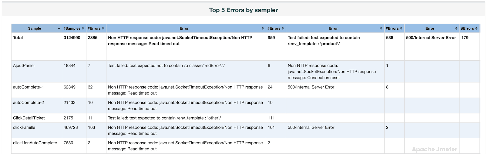
Top 5 Errors by Sampler Table
The “Top 5 Errors by Sampler” table provides valuable insights into the most frequent errors encountered during a performance test, organized by the type of sampler used. This table helps identify specific issues that impact application performance and user experience.
Relationship with APDEX:
Impact on User Experience:
Errors detected by specific samplers can directly influence the APDEX score.
High error rates or critical errors can contribute to a lower APDEX score, indicating decreased user satisfaction.
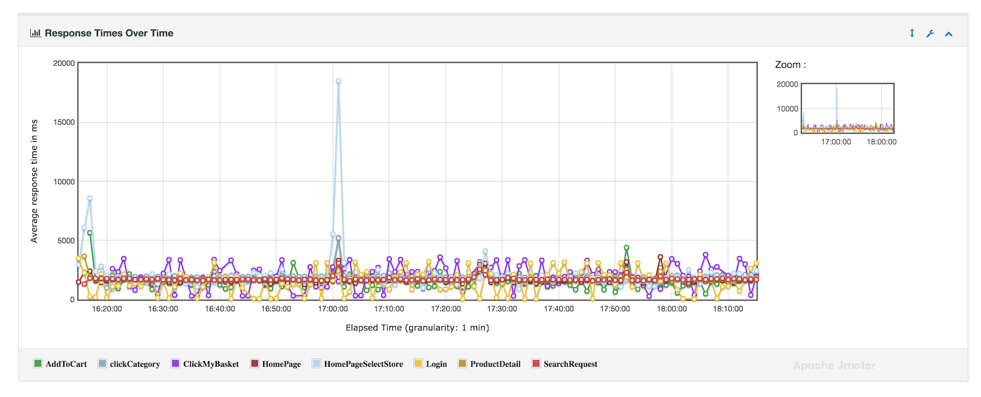
Response Times over Time Chart
The “Response Times over Time” chart provides a visual representation of how response times evolve over the duration of a performance test. This chart is essential for understanding the overall performance characteristics of your application and identifying any patterns or anomalies in response time behavior
Relationship with APDEX:
Impact on User Satisfaction
The “Response Times over Time” chart directly influences the APDEX score calculation.
Higher and inconsistent response times can lead to a lower APDEX score, reflecting reduced user satisfaction with the application’s performance.
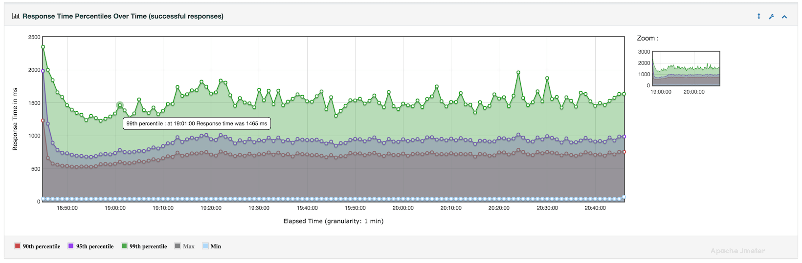
Response Times Percentiles Over Time Chart
The “Response Times Percentiles Over Time” chart provides a detailed view of how response times distribute across various percentiles throughout the duration of your performance test. This chart is crucial for understanding the consistency and variability of response times experienced by users during the test run.
Relationship with APDEX:
Influence on User Satisfaction:
The “Response Times Percentiles Over Time” chart directly influences the APDEX score calculation.
Higher response times, especially at critical percentiles, can lead to a lower APDEX score, indicating reduced user satisfaction.
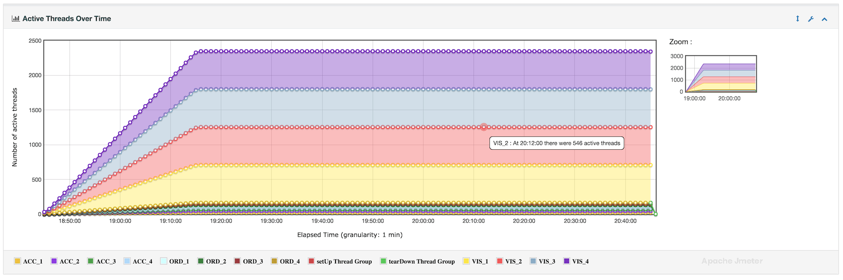
Active Threads Over Time Chart
The “Active Threads Over Time” chart provides a visual representation of how the number of active threads (simulated users) changes over the duration of your performance test. This chart complements the APDEX score by showing how the system load fluctuates during the test run
Relationship with APDEX:
Correlation:
The “Active Threads Over Time” chart complements the APDEX score by providing context about the system load dynamics.
High thread counts during specific intervals might correlate with degraded performance (e.g., longer response times), impacting the APDEX score.
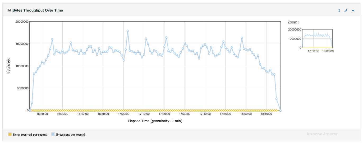
Bytes throughput Over Time Chart
The “Bytes Throughput Over Time” chart provides insights into the data transfer rate or throughput of your application over the course of a performance test. This chart visualizes how the amount of data transmitted by your application changes over time, helping to understand the impact of load on network and server resources.
Relationship with APDEX:
Optimizing Resource Usage:
Throughput metrics influence overall application performance and user satisfaction.
Higher and stable throughput rates contribute to better APDEX scores, indicating satisfactory user experience.
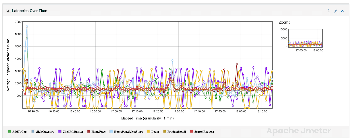
Latencies Over Time Chart
The “Latencies Over Time” graph provides a visualization of how response latencies (response times) vary over the duration of a performance test. This graph helps in understanding the distribution of response times and identifying patterns or trends in application performance.
Relationship with APDEX:
Impact on User Satisfaction:
Latencies directly influence the APDEX score, which reflects user satisfaction based on response time thresholds.
Lower and stable latencies contribute to higher APDEX scores, indicating better application performance.
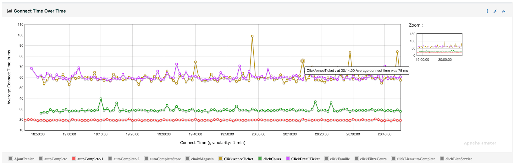
Connect Time Over Time Chart
The “Connect Time Over Time” graph provides insights into the time taken to establish connections with the target server over the duration of a performance test. This graph is valuable for understanding network-related performance metrics and identifying potential issues related to server connectivity.
Relationship with APDEX:
The “Connect Time Over Time” chart directly influences the APDEX score, which measures user satisfaction based on response time thresholds. Unstable or prolonged connection times can negatively impact the overall APDEX score, reflecting poor application performance.
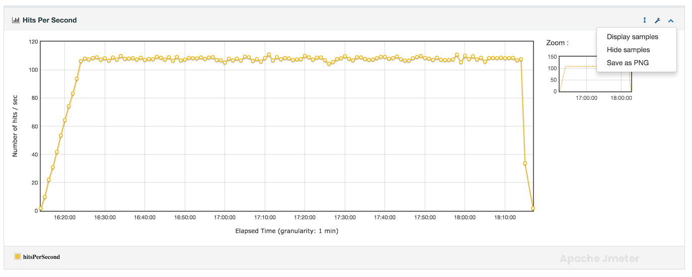
Hits Per Second Chart
The “Hits per Second” chart in APDEX report provides a visualization of the number of HTTP requests or transactions processed per second over the duration of a performance test. This chart is crucial for understanding the load placed on the target application server and monitoring its capacity to handle incoming requests.
Relationship with APDEX:
The “Hits per Second” chart influences the APDEX score by reflecting the level of stress placed on the application under test. Higher request rates may impact response times and throughput, directly affecting user satisfaction as measured by APDEX.
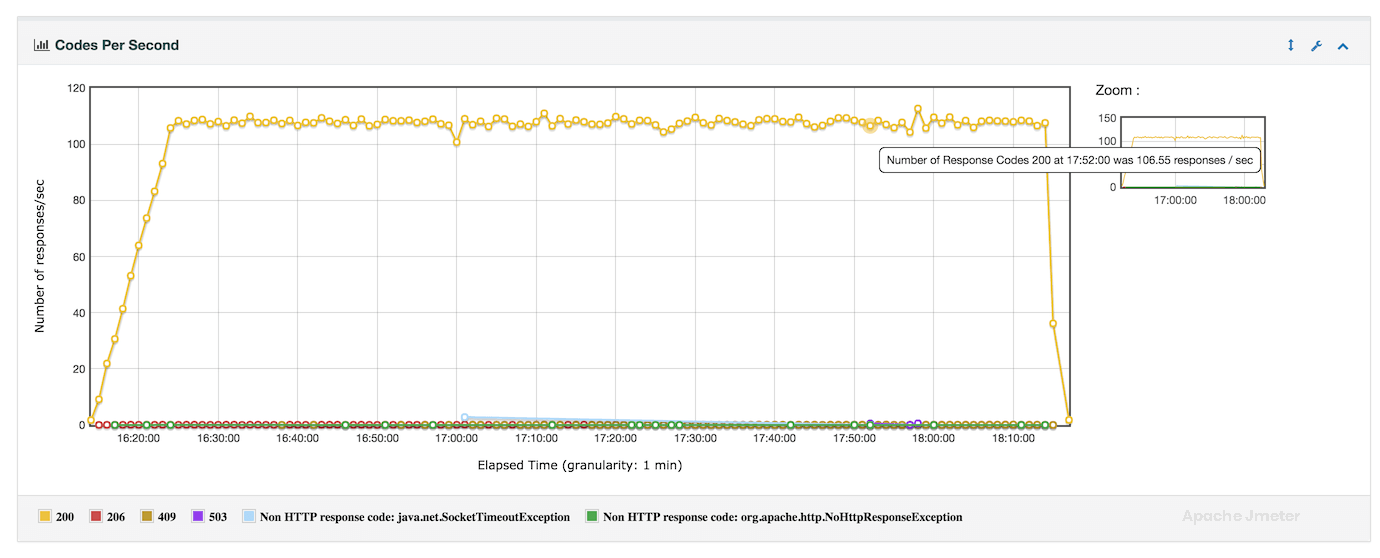
Response Codes Per Second Chart
The “Response Codes per Second” chart in APDEX report provides a graphical representation of the distribution of HTTP response codes received from the target server over the duration of a performance test. This chart is essential for identifying the frequency and pattern of different HTTP response codes, which helps in diagnosing issues related to application performance, server behavior, and user experience.
Relationship with APDEX:
The “Response Codes per Second” chart directly influences the APDEX score by reflecting the quality of user interactions based on response code outcomes. A high frequency of successful responses contributes positively to APDEX, while a significant number of errors can impact user satisfaction.
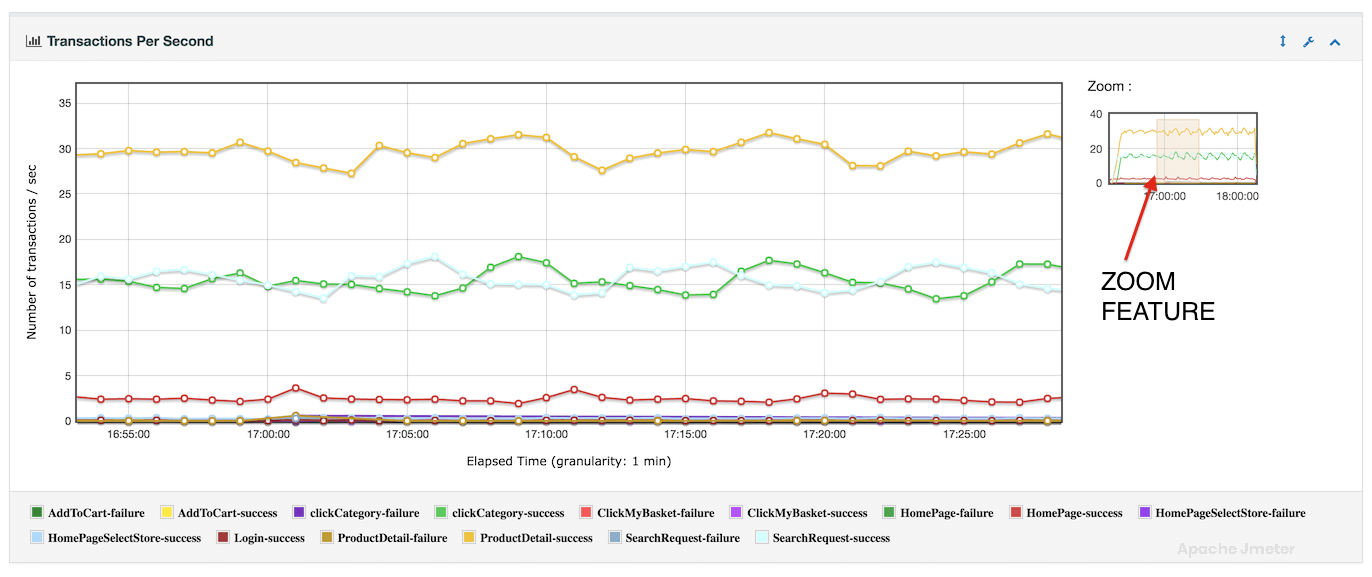
Transactions Per Second Chart
The “Transactions per Second” chart in APDEX report visualizes the rate at which transactions or requests are processed by the target application server over the duration of a performance test. This chart provides valuable insights into the throughput and load capacity of the system, helping to assess performance under different user scenarios.
Relationship with APDEX:
The “Transactions per Second” chart directly influences the APDEX score by reflecting the system’s ability to handle user interactions within acceptable response time thresholds. A higher transaction rate, coupled with satisfactory response times, contributes positively to APDEX.
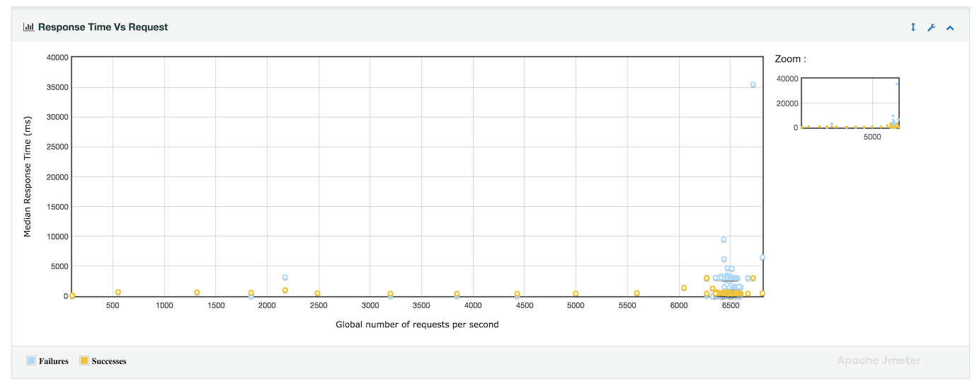
Response Time vs Request per second Chart
The “Response Time vs Requests per Second” chart in APDEX report provides a comprehensive view of how response times vary with different levels of request throughput over the course of a performance test. This chart is valuable for understanding the relationship between system load (number of requests per second) and application responsiveness (response times).
Relationship with APDEX:
The “Response Time vs Requests per Second” chart directly influences the APDEX score by illustrating the impact of request load on user satisfaction. Higher request throughput with acceptable response times contributes positively to APDEX, while increased response times under heavy load may negatively affect user experience.
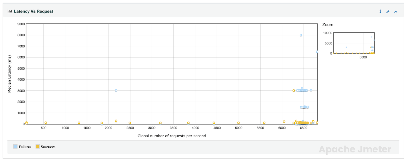
Latency vs Request per Second Chart
The “Latency vs Requests per Second” chart in APDEX report provides a visualization of how latency (response time) is affected by varying levels of request throughput during a performance test. This chart helps in understanding the relationship between system load and response time latency.
Relationship with APDEX:
The “Latency vs Requests per Second” chart directly influences the APDEX score by illustrating the impact of request load on user experience. Lower latency (faster response times) under higher request throughput contributes positively to APDEX, reflecting better application performance.
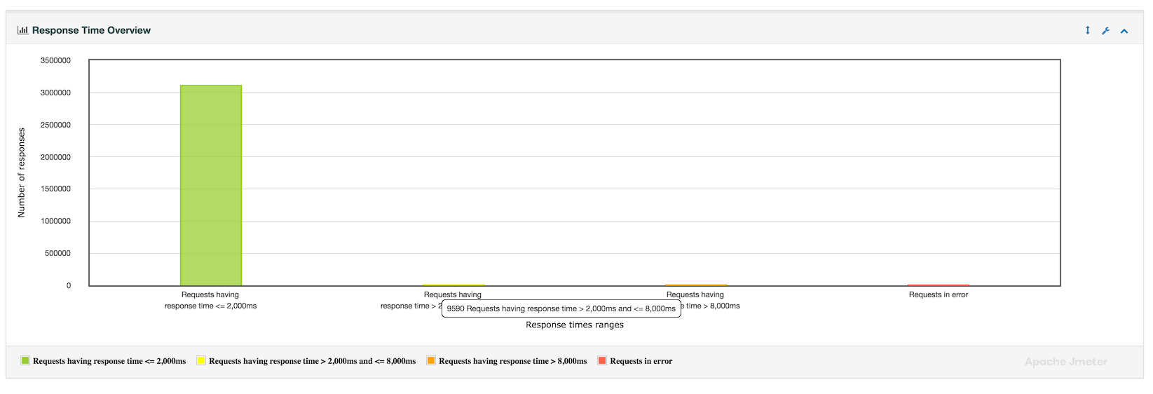
Response time Overview Chart
The “Response Time Overview” section provides a comprehensive summary of response time metrics collected during a performance test. This overview is crucial for understanding the distribution, performance, and reliability of the application under various load conditions.
Relationship with APDEX:
The “Response Time Overview” is closely tied to APDEX scoring, as it provides the foundation for assessing user satisfaction based on response time thresholds. Lower response times across key metrics contribute positively to APDEX scores, reflecting better application performance and user experience.
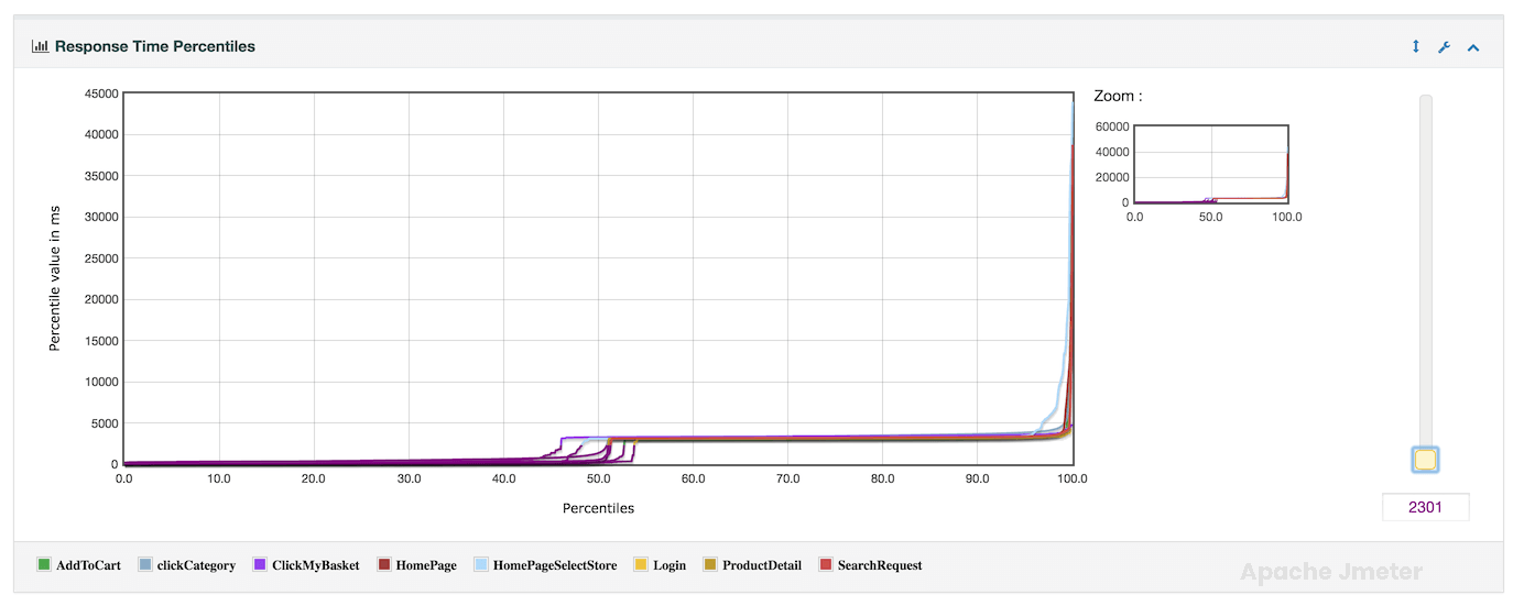
Response times percentiles Chart
The “Response Times Percentiles” section provides detailed insights into the distribution of response times across different percentile levels during a performance test. This information is crucial for understanding the performance characteristics of the application under various load conditions.
Relationship with APDEX:
Response time percentiles are fundamental to calculating the APDEX score, as they determine user satisfaction thresholds based on response time targets. Lower response times across key percentiles contribute positively to APDEX scores, reflecting better application performance.
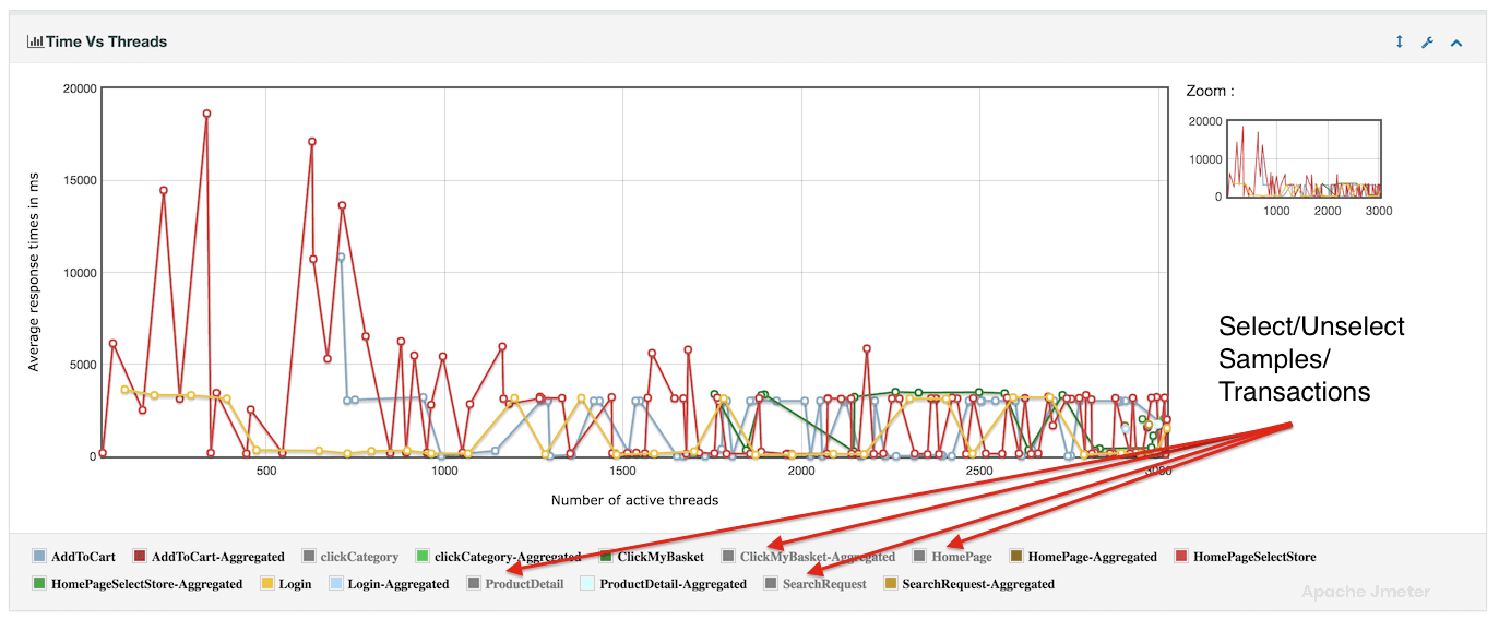
Times vs Threads Chart
The “Response Time vs Threads” analysis or chart illustrates how response times change as the number of concurrent threads (virtual users) in a test increases. This analysis is crucial for understanding the application’s performance under different levels of concurrency.
Relationship with APDEX:
The “Response Time vs Threads” analysis directly impacts the APDEX score.
Lower response times at higher concurrency levels contribute to a better APDEX score, reflecting improved user experience under load.
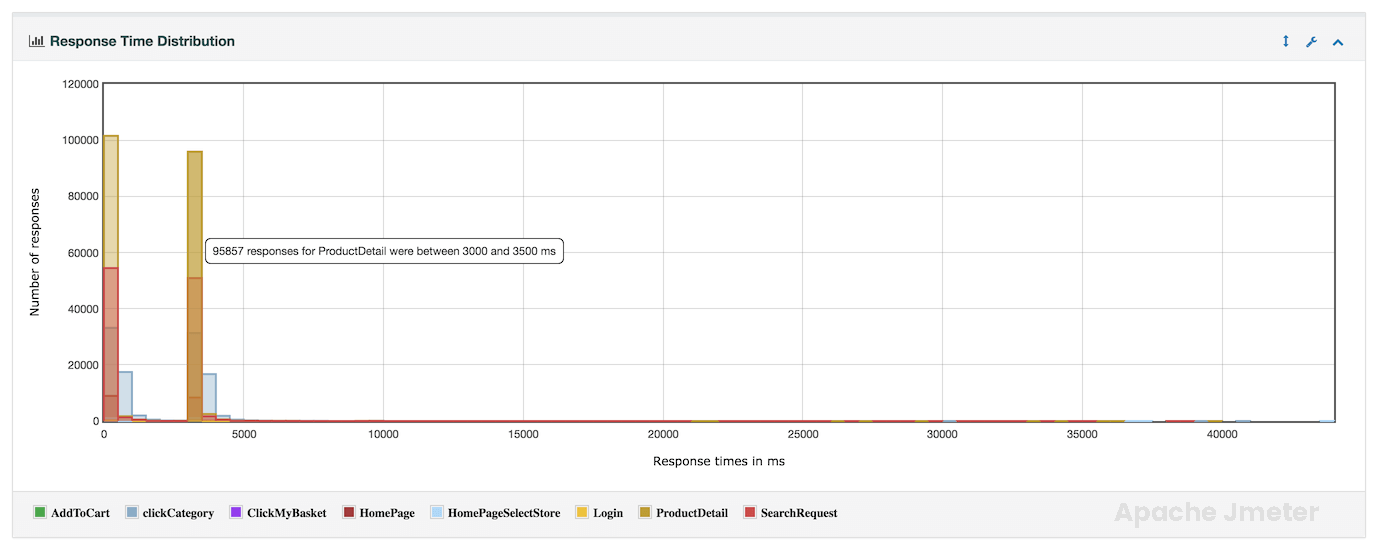
Response Time Distribution Chart
The “Response Time Distribution” provides a detailed breakdown of how response times are distributed across different percentiles during a performance test. This analysis helps in understanding the overall performance characteristics of the application and identifying response time outliers.
Relationship with APDEX:
The “Response Time Distribution” analysis is essential for performance testing and optimization in JMeter, providing valuable insights into response time variability and performance at different percentile levels. Use this analysis to optimize application responsiveness, diagnose performance issues, and ensure that the application meets performance objectives. By leveraging response time distribution alongside other performance metrics, you can improve application reliability, scalability, and overall user satisfaction. Adjust test configurations based on distribution findings to optimize response times and deliver superior application performance under varying load conditions.